-cutout_edited.png)
On Art in Sacred Texts in the Coptic Tradition
- Peter Attia
- Jan 31, 2023
- 11 min read
Updated: Feb 28, 2023
When picturing a printed sacred book, one might visualize two to three columns of small-print, tightly-packed text devoid of anything visually interesting and with no incorporation of illustrations of any sort — perhaps out of deference to the text. Open your nearest Bible, your ⲁϫⲡⲓⲁ (agpia, prayer book of hours), or your church’s ⲉⲩⲭⲟⲗⲟⲅⲓⲟⲛ (euchologion, kholagy, liturgy prayer book) – assuming these are not children’s editions, it is more likely than not that little to no visual art will be represented in the book, barring the cover and perhaps also the first few pages. This, however, was not always the case. Visual art, whether illumination[1] or iconography, was consistently used in sacred manuscripts in the Coptic tradition.
Allow me to relay an anecdote. A member of my parish asked me where the design of a certain Christian hoodie came from. (The design in question is included below as Exhibit 3 of Ms. Or. Quart. 474.) I replied that it was a page from an old Koiahk psalmody book. He was confused, and I, ironically, was confused by his confusion. Upon being asked why he was confused, he responded by inquiring, “Why would it have a design in it?” My answer generally conveyed the substance of this article: most old Coptic books (manuscripts) included art, and there is even a modern liturgical book that incorporates artwork within it (See the final exhibit labeled “A modern example!...”). I tell this story because prior to his question, it had not occurred to me that the average Copt would be unaware of the distinctive artistic features contained within Coptic manuscripts, and I cannot blame them for this lack of familiarity. Just as I noted above, if you were to check any of your modern ecclesiastical books, it is more likely than not that you would find its contents bereft of art. I do not wish to speculate regarding why it was bewildering to this young man to find artistic designs within a liturgical book, but I suspect there are many more Copts to whom the use of art in sacred writings might at first glance seem strange.
From at least the 8th to the 18th century, there was some sort of artwork incorporated in ecclesiastical manuscripts (whether Scripture, psalmodies, or euchologia) — be it full-page pieces of art opening a section, illustrations incorporated within the lines of the text, small artworks represented in page headers or borders, or even very simply the first letter of the first word in a “paragraph” being ornamented or artistically accentuated. This incorporation of art in the Coptic liturgical manuscript tradition was prevalent enough that any manuscript from at least these centuries contains at least one of these four types of visual flourishes. (Examples of each will follow this article.) This extent of artistic incorporation may also be present in non-liturgical manuscripts, as can be seen, for example, in a certain manuscript (existing in fragments) containing various sermons of St. Shenoute the Archimandrite that makes use of artistic frames to introduce either sections or perhaps even different sermons.
As for the reason for the incorporation of art in Coptic sacred texts, I can only presume. Perhaps it is to appeal to the readers’ senses — to strive to match the visuals of the page with the beauty of the meaning of the text within, the beauty of the liturgical services in which the text is used, and the beauty of the tunes placed onto the texts, to enable the holistic immersion of the worshiper in liturgical participation. Indeed, an integral part of the Church and her services is beauty — just look at the architecture, iconography, and vestments! Iconographer Kirollos Kilada once reflected:
We have a tendency to focus on function at the expense of beauty, but this isn't how the Church experienced liturgy. This focus on function is what has led people to leave books behind. If books serve just to contain the text, then they can easily be dispensed with. But the book itself should be a beautiful liturgical object that we hold in our hands and that brings us into deeper communion with Christ, as do icons, architecture, vestments, etc. Everything is made beautiful for the glory of God, to call our minds to Paradise.
One last presumption as to the inclusion of art into the manuscripts is to view the making of the manuscript, and not only its use in prayer and worship, as an offering or sacrifice to God. Keep in mind that the end goal of these manuscripts is that they be used by the faithful in their worship of God. The manuscript is therefore a tool for worship. It is a tool by which we can offer the sacrifice of praise. But how is the making of the manuscript a sacrifice itself? Think about the time and effort and skill needed to craft a manuscript, even without the artwork. Those who prepare each manuscript offer their time to make this liturgical object and utilize their craftsmanship and artistic talent to make this tool to the best of their ability. Liken this to an iconographer or one who creates vestments. They put their best effort into creating something beautiful to be used in the liturgy. They offer their best to God. When viewed in this light, one might recognize this as a message as old as the biblical account found in chapter four of the Book of Genesis.
This chapter, for those unaware, recounts the story of Cain and Abel. How does manuscript making relate to this inspired account? After all, Cain and Abel probably did not even have writing systems. Recall, however, the event that caused Cain’s anger and hatred towards his brother Abel, which eventually led Cain to murder Abel. Cain and Abel both offered sacrifices to God. Abel’s was accepted, while Cain’s was rejected. Why? Is it because of what was offered? Clearly not, as we find in the Book of Isaiah:
”…you shall not continue! If you bring fine flour, it is pointless. Incense is an abomination to me; I do not tolerate your new moon festivals and Sabbaths and great day. Fasting and rest, and your new moons and your festivals, my soul hates. You have become excess to me; I will no longer forgive your sins.” (Isaiah 1:13–14, Lexham English Septuagint, 2nd ed.)
Here we see that God is not pleased simply by what we offer to Him, but how we offer it. In these verses, the Lord says that incense, feasts, Sabbaths, and fasts are all abominations to Him. While these are all things prescribed in the Law for the children of Israel to do in their worship of the Lord God, the Israelites at the time of Isaiah did not perform them in the proper manner or with the right spirit or purpose. This is what causes an offering to become an abomination to God. In the same way, Cain’s sacrifice was rejected due to how it was offered. This is the interpretation offered by St. John Chrysostom in Homily 18 of his Commentary on Genesis:
It is not without reason that in our previous interview I told you that God, who does not accept anyone, probes the will and rewards the intention of the heart. This remark finds here its correct application. That is why this passage of Genesis deserves a profound examination, and it is necessary to stop there seriously to understand well what is said of Cain and Abel. For there is nothing useless in Scripture, and a syllable, even a letter, contains a rich treasure, since we can always draw from it a moral sense. But what does she tell us? And it came to pass, long after, that Cain offered to the Lord a sacrifice of the fruits of the earth, and Abel also offered the firstborn of his flock and the fat ones.
A penetrating mind understands at a simple reading the meaning of this passage. But I owe it to all, and the Gospel doctrine is equally addressed to all; I will go into some explanations, so that you will be better educated. Cain, says the Scripture, offered the Lord a sacrifice of the fruits of the earth. As for Abel, he chooses the productions of pastoral art as his own. And he offered the firstborn of his flock and the fat ones. Already these words alone show us all the piety of Abel, for he does not offer only a few sheep taken at random from his flock, but the firstborn, that is to say, the most beautiful and the most precious; and even among them the fatter, that is to say all that was better and more excellent. But with regard to Cain, Scripture does not enter into any detail; she contented herself with telling us that he offered a sacrifice of the fruits of the earth, and thus lets us suppose that he took the first that fell to her hand, and that he disdained to choose the most beautiful.
I have already said it, and I will not cease to repeat it. If God receives our sacrifices, it is not that He needs them. He only wants to facilitate the means to show him our gratitude. That is why the man who offers in sacrifice the very things that he holds of God, must, to fulfill this religious duty, choose all that he has of the best. Otherwise, he would not understand how much God is superior to him and how much he is honored to fulfill these priestly functions …
Now that we have addressed the prevalence of art in the Coptic manuscript tradition and provided some theories as to its purposes and possible motives for its incorporation, let us now make note of any motifs or common patterns that arise within these artworks over the centuries. Firstly, the colors used: commonly black and red. Black is typically used as the main color, particularly for the body of the text – or, at least, a majority of it – while red is used for accents (such as markers to separate each line into quatrains, to act similarly to punctuation, or even to accentuate certain letters, be it the first letter of a section or letters that naturally were written larger by hand such as ϧ, ⲫ, and ϩ) and for headings/introductions or the first/second line of a text. Sometimes red ink is used more frequently, such as for every other verse of the hymn being copied. Other common colors are yellow and green; less common yet still prevalent colors are blue, gold, and brown. I will not delve into attempting to explain the meanings for the various colors, as I find such attempts to often be inconsistent and excessive, particularly since similar designs can be found across different manuscripts with the only difference being the colors used, with no obvious explanation as to the discrepancies or choice of color in any given manuscript. I do believe that in most instances the colors used were simply whatever was available to the manuscript’s creator, or whatever they thought would look most appealing. For instance, most of the art in the modern examples provided below is dichromatic, utilizing both red and gray. The manuscript preparer was certainly able to utilize more colors, and in fact did on certain pages, so color selection is likely attributable to either the artist’s discretion or what colors were available to the artist whenever and wherever the piece was prepared.
One fairly frequent element in some manuscripts, which I admittedly did not notice until compiling the exhibits below, is the peacock. Peacocks are an ancient symbol of immortality, eternal life, resurrection, renewal, and God’s omnipresence, and are commonly utilized not only in Coptic art but also in both Christian and non-Christian art more generally. Peacocks symbolize eternal life and immortality due to the ancient belief that peacocks were incorruptible. Aristotle claimed their flesh did not decay after death, and St. Augustine later tested this theory and concurred with it, as he records in Book 21 of his work City of God. Peacocks also represent renewal since male peacocks shed and regrow their plumage each spring. Due to their association with springtime renewal and eternal life, peacocks also signify the Resurrection. Finally, the connection between peacocks and God’s omnipresence arose from the appearance of a male peacock’s feathers when it displays its tail – the circular design on the tail looks like many watching eyes, thus becoming associated with the all-seeing eye of God.
Copts also seem to have loved geometric constructions. There are several examples of art that can be deconstructed into, for example, many smaller circles, but when viewed holistically forms one intricate, beautiful piece (See Ms. or. quart. 474 exhibits below) — an example of simplicity forming beautiful complexity. An even more prevalent style of art which exemplifies this use of simple subunits to render a singular, masterful piece of art is Iota art.
Iota art is a prevalent, authentic Coptic design used frequently in Coptic manuscripts throughout the centuries. It can be seen as a mosaic of sorts, forming a larger piece by combining many smaller components. The key, or the most prevalent subunit, in Iota art is the iota (hence the name of the style; pronounced “yo-ta”), resembling the Greek/Coptic letter iota which is the first letter in the name of Jesus Christ, the “name of salvation”[2] — indeed, Coptic art endeavors to express the Coptic faith. Many, when shown the Iota cross, describe the iota as a “bone” based on its shape — to clarify which shape is referenced. The iota component’s shape is often modified to work for the overall piece, such as elongating the piece (called a rectangular iota below) or rounding it around to make it loop into the rest of the piece (See BnF Copte 68 exhibits). When looking at these beautiful, complex constructions, the basis of the structure is The Iota, Jesus Christ. Below is a figure with the different subunits compiled by Vivian Michael citing two other works (El Bramosy, H.I.: Iota Art Printed. Cairo: Nobar Press (2008) & Demetrius, B.: Write and Pray Little by Little. A Stepwise Program to Teach the Coptic language. Cairo: Bishop Demetrius (1994).) and a simple Iota cross; notice the chain/knot/link motif in both examples.


Finally, below are a number of examples of the art discussed, spanning the 12th to 21st centuries. Try to make note of what was previously discussed and see the distinct yet consistent Coptic style that pervaded the manuscripts from these centuries.
BnF Copte 13 – Four Gospels (AD 1178-1180)
Exhibit 1:

Opening pages of the Gospel of Matthew showing an icon of the evangelist on one page and on the other page the Biblical text is bordered with this pattern, which is fairly common in Coptic manuscripts.
Exhibit 2:

Here an illustration of the Baptism of Christ is drawn directly into the text of Matthew 3 between verses 16 and 17. Along with this you can see floral illuminations on the sides of the page.
Exhibit 3:

Here we see variations of the Iota cross on the headers of the page and more floral illuminations on the right page.
Ms. or. quart. 397 – Koiahk Psalmody (AD 1760)
Exhibit 1:

Here we see a border/frame drawn to introduce the third ode.
Ms. or. quart. 474 – Koiak Psalmody (AD 1500)
Exhibit 1:

This is the opening page of a psalmody and we are already greeted with some geometrically well-crafted art on the left page, and on the right page above the first hymn we see some Iota art.
Exhibit 2:

Introducing this psali is a multicolored frame with a woven pattern, which is also common. One may argue that this pattern is an extension of Iota art. The drawing of a bird is actually the letter alpha.
Exhibit 3:

Here we have the first drawing revisited, this time completed in color, and the floral geometric pattern becomes a pattern in these pages as its frame introduces the Thursday Theotokion and the pattern and colors are incorporated with the first letter of the hymn.
Exhibit 4:

The design on the left page incorporates much of what we have seen thus far. Floral designs, geometric patterns, and Iota art. The Iota art is continued on the next page to introduce the Friday Theotokion.
BnF Copte 68 – The Rite of the Procession for the Feast of St. Shenoute (AD 1401-1500)
Exhibit 1:

This is the opening page. We can already see how colorful it is. The cross on the top is a variant of the Iota cross. It is harder to see the components as the cross is drawn in small size in a such a tight area and with a more limited color palette. The frame beneath is more clearly a Iota frame. The colors are incorporated into the opening words of the texts as you can see.
Exhibit 2:

A later introductory page, again with the Iota frame.
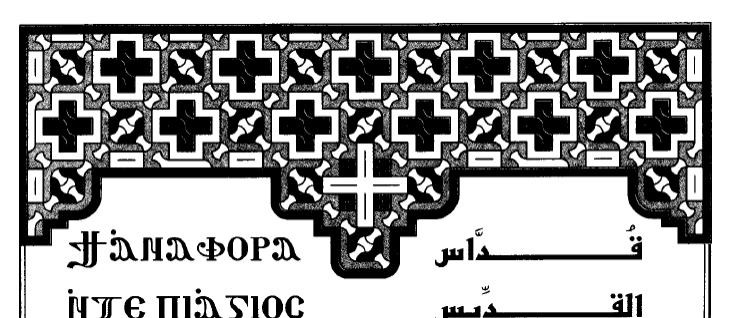
Ms. or. quart. 398 – Euchologion with the Anaphora of Gregory and Cyril (AD 1750)
Exhibit 1:

On the top we see a Iota frame. Also the first letter is stylized with a peacock resting on top, which was a common element seen in previous exhibits.
A modern example! The 2015 reprint of the 1902 Abdelmassih Euchologion by Baramos Monastery


Contains many colorful, digitized Iota artworks scattered throughout, mostly in shades of red and gray.
—
[1] The term “illumination” in the context of manuscripts or books means adornment with colored illustrations.
[2] Cf. Acts 4:12; Romans 10:13. See, e.g., Sunday Theotokion, 1.4; Thursday Psali, 2; Friday Psali, 9, 11-12. Also note the name “Jesus” means “YHWH is salvation.”
—
Dr. Peter Attia is a pharmacist and serves as a reader in the Coptic Orthodox Church in New York. He is interested in Coptic language, ritual theology, hymnology, and other aspects of Coptic Orthodox life and culture.
DossPress.com is a place for Christian men and women to collaborate for the sake of our common edification by sharing their written works. As we strive to uphold a standard of doctrinal and spiritual soundness in the articles shared, we note nonetheless that the thoughts expressed in each article remain the author’s own and do not necessarily reflect those of Doss Press.


